Showing posts with label print. Show all posts

Wednesday, September 7, 2011

Print isn’t dead

Perhaps I’m not the norm here, but judging by my sales so far, print is definitely not dead yet. I have 15 sales – not a ton, I realize, but it’s a start – and of those 15, 7 are print copies. (7 print, 7 Kindle and 1 Nook) I’m finding that as I promote the book to people I know, more often than not, they don’t have an ereader, and therefore wouldn’t have been able to get my book if I wasn’t offering a paperback edition.

I guess the lesson to other self-publishers is: offer a print edition.

It really isn’t hard. There are print-on-demand companies like CreateSpace and Lulu that make the process relatively painless, and it’s not too expensive to get it going. Personally, I used CreateSpace, and the only cost I’ve incurred so far is the $39 Pro Plan (which lets me get higher royalties and makes their Extended Distribution available if I choose to utilize it later on). The ISBN was free, and I created the PDF and cover myself, so there was no cost there. Now, if you don’t have the software or experience to do those things on your own, you’ll have to outsource, but you need a cover even for an ebook, so you’ll have already faced that issue anyway. And making a PDF of the interior isn’t that difficult. I used Adobe InDesign, but I’m pretty sure word processing programs like Word can do it as well.

Point is, if you self-publish and choose to only publish ebooks, you’re probably losing some sales. Not everyone is on board the ebook bandwagon yet, and I don’t know about you, but I don’t feel right lecturing them on how you can still read ebooks on your computer via apps like Kindle for PC (or Nook for PC). Personally, I can’t read anything longer than a blog post on a computer screen without getting a horrific eye strain headache. That’s why I prefer my Kindle and don’t use my iPad as an ereader. Backlit LCD is not kind on the eyes, and I think that’s why a lot of people are resistant to ebooks.

Monday, August 22, 2011

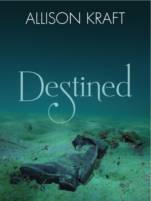
Cover tips for print

I mentioned in a previous post that when I first uploaded my book to CreateSpace, I got a message that the cover had transparent layers, and that flattening them had resulted in a color shift. I debated leaving it and waiting to see if it really did look any different or not (some accounts I found online claimed they got the same message, but that the cover looked fine). But in the end, the perfectionist in me won out and I looked up how to flatten the cover myself, so that I would be sure everything would look exactly how I wanted it.

In case anyone else comes across a similar problem, this is what I learned:

When saving a file in PDF format that is compatible with Adobe 5 or higher, transparency and layers are retained. This is supposed to be to avoid shifts and changed colors from the flattening process, and since a lot of PDFs are only viewed online and not printed, it works fine. But some printers (apparently, CS is one of them) have to have the file flattened completely before they print, so a PDF with transparent layers is a problem. They can flatten it themselves, but sometimes this results in the previously-mentioned color shift (where a layer moves slightly and has that blurred/double-vision/3D-without-the-glasses look). Depending on what program you’re using, you can sometimes flatten the image before saving it to a PDF (Photoshop is one that lets you do this), but not all can. In my case, I was using a combination of Photoshop and Illustrator to do my cover. I did the background image in Photoshop, then used Illustrator to do the text and other elements, because Illustrator is a vector program and therefore gives me better end resolution, as well as more freedom with the text layout and other elements.

Anyway, I tried a few different things to get my PDF flat, and after some trial and error, came up with a way that worked for me. First, rather than placing the background PSD file (the Photoshop file with all the layers) directly into my Illustrator file, I saved the background as a high-res TIFF. This flattened the layers in the background, but still gave me a high-resolution image, which is necessary to maintain good print quality. I found later that this step was necessary, because when I was using the PSD, I was getting weird lines everywhere from Adobe trying to flatten it all into the PDF later. Flattening the background on its own and using a TIFF got rid of those lines.

Then, I exported my cover to a PDF as I had before. I tried exporting directly to an Adobe 4-compatible file, which is supposed to flatten everything, but I didn’t like how the end result looked. I had the line problem again, for one, and it made me nervous. So instead I kept the default PDF settings, then opened the resulting PDF in Acrobat Professional (I don’t think this works in Adobe Reader, sadly). Under the Advanced menu, I went to PDF Optimizer, clicked on the Transparency field on the left side of the box that came up, and selected “High Resolution” from the Preset options. Then OK. Give it a new name so you don’t overwrite the non-flattened file (in case something goes wonky and you need to try it again), and there you have it: a flattened PDF. Of course, this is just what worked for me. Other programs will have other ways of flattening, and for some, exporting straight to an Adobe 4-compatible file may work just fine. But if it doesn’t, flattening in Acrobat worked for me, so it might work for you as well.

One other note: for some reason, after flattening a PDF, you might see faint lines around certain parts of the image. This freaked me out at first, but it turns out most of the time, they’re just glitches in how your monitor is processing the file, and not problems with the file itself. (In other words, the phantom lines are just that: phantoms. They won’t print.) The best way to be sure this is the case with your file is to zoom in on an area that has a line. If the width of the line doesn’t change, or it goes away at higher magnifications, than it’s an issue with the monitor’s output, and not a line in the actual file. If the line stays there and increases in size along with everything else, then you have a problem. This is what happened to me before I flattened my PSD file: I had a thin line where one layer met another, and it would have printed that way if I hadn’t fixed it. But if your lines are the same size at 1600% magnification as they are at 100%, then you can breathe easy. It will print just fine. (Or at least, it will print without the lines.)

In other news, my proof is coming today, and if it' looks good, then I’m going to set my release date for this Friday! Woo!

Tuesday, August 16, 2011

The importance of the proof

When I submitted my files for the print edition of Destined, I was sure they were prefect, and that I wasn't going to have to make any corrections. Even better, CreateSpace was having a promotion where the first proof was free (plus shipping), so I thought I was going to get this done pretty cheaply. Ha.

Despite the numerous edits I've done (NUMEROUS), I still managed to miss things. There's something about reading on actual paper, I think, that makes it easier to spot errors. Up until now, I'd been proofing either on the computer, on my iPad, or on the Kindle/Nook. eInk is nearly as good as paper, but it's still not quite the same, because you're still reading on a device. Or maybe I just wasn't looking closely enough before, who knows. Point is, reading through that first print proof was good, because I caught more than I expected.

The weirdest mistake I hadn't noticed before (partly because it's only in the print version)? Backwards apostrophes!  Somehow, when I was writing the book in Microsoft Works, it auto-formatted some of the apostrophes wrong, and I never noticed. They're small, so unless you look closely, you can't really tell. But it's there, and now that I've spotted them, they're driving me nuts. Thank goodness for find/replace, because there's no way I would have caught them all with my naked eye!

My story's probably a good lesson in favor of hiring an outside editor, but I'm stubborn about editing my own stuff. Besides, all these editing passes I've done have turned up more than just mistakes: they've shown me parts of the book that can be improved, and I think the end result is much better for it. It was time-consuming, but worth it. Call me a control freak, but I still prefer to do everything myself.

Now all that's left is doing one last skim to make sure the changes I made don't have errors, and finally getting that author photo taken, so I can put it on the cover before I submit for the second proof. Then while I'm waiting for the proof to ship, I can go through the ebooks to make sure they're still okay. (A lot of the changes I made were more than formatting, so I had to change the Kindle and ePub as well.)

Friday, August 12, 2011

It’s here!

The proof of my print edition arrived today! It's all shiny and pretty and I'm in love with it. I haven't had a chance to really go through it to look for errors, but the quick scan I did looks good, so I'm hopeful.

I'd prefer not to have to resubmit and buy another proof, but if I do find something inside that needs fixing, I may also tweak the cover a little. For one thing, it printed a tad bit darker than I intended. I find that problem crops up a lot with printing—something will look perfect on a monitor, but will print dark. Still, it's only a slight bit darker, and I doubt anyone but me would even notice. I also may change the description on the back. I used the one from my website, but have since edited it a little (nothing drastic, just a few words here and there), and now that I'm looking at the book, I'm wondering if it isn't too wordy. The font size is a little small due to the length, and a bit light as well (it's white on black). I could cut down the amount of text and therefore make the font bigger and/or bolder, without taking up more space. And if I'm going to be doing that, I really should get an author photo taken to add to the back cover. I don't have one right now, and I don't think it's too big a deal for it to not be there, but if I'm going to be resubmitting, might as well add it, right?

I have to say, I'm really impressed with the quality of the book. Coming from a POD, I was worried it was going to look "homemade," but it really doesn't. If I didn't know any better, I wouldn't be able to tell the difference between it and a traditionally-published trade paperback! The one thing that glares at me right now is the lack of publisher name/logo on the spine. Every book has that, and since I chose not to start my own company right now, I don't have a publisher name to use there. Hm. Maybe I should come up with a logo for myself and put it there instead?

For those of you who are considering self-publishing and are wondering which POD to use, I highly recommend CreateSpace. Great quality product, quick and easy process, no complaints at all so far. And by buying the $39 pro plan, I'm able to keep the selling price under $10 and still make a small profit on each book I sell through Amazon.com. (I'd have to go up to $11 or more to profit on the extended distribution channels, but I have no plans to use those now, so it's not a concern to me.)

Monday, August 8, 2011

Release Date. Sort of.

One of the downsides I've found with self-publishing is that you can't really set a firm release date. When you're done editing and formatting and are ready to go, you submit your files to the various sites (Amazon, B&N, Smashwords, CreateSpace, etc.) and then wait for them to approve and publish your book. There's no guarantee exactly when that will happen, and you can't tell them to wait until a specific date to do it (at least, not that I've seen). So I can't really say "DESTINED will be out August 29th!" because I can't know for sure that it will be out then.

What I can say is that, if all goes well, I believe the book will be available for sale in both print and ebook format by the end of August. Print will be available on Amazon.com and from CreateSpace's estore for $9.99. The ebook will be available for Kindle at Amazon, Nook at B&N (price TBD, though most likely either $2.99 or $3.99) and I'm still researching the other outlets. It looks like Kobo finally has a way for authors to self-publish, so I'll be looking into that. As for Sony and Apple, I haven't researched Sony yet, and it sounds like I'm out of luck with Apple unless I either get a Mac or use Smashwords, neither of which I'm keen to do right now. I have an iPad, but apparently that's not enough. It's a shame they make it so difficult, because I have the ePub all formatted and ready to go!

Once I get my print proof back and can look it over, I'll be all set. I want all the formats to release around the same time, so right now I'm held up on the print proof. I see that the review process is done and I can order a proof, but there's a warning about transparency in my cover PDF, so I have to check that out when I get home from work before I order the proof and waste any more time. It says the flattening created a color shift, which makes me nervous. I thought the flattening was already done when I originally saved the PDF in Illustrator!

Saturday, August 6, 2011

Now for the not-as-fun part

I have my print version finally done. I changed my mind a few times regarding trim size and margins, so ended up re-formatting more than I’d have liked. But I finally have it where I want it, and it’s looking good. Which means I’m finally ready to get going on the actual publishing.

Before I do anything with the ebooks, I wanted to get things started with CreateSpace and get a proof on its way to me. And now I’ve hit a bit of a wall, because I’ve come up to the ISBN portion of the process, and I’m confused.

Originally, I was going to get the $10 custom ISBN, so I wouldn’t have to have CreateSpace listed as my publisher/printer. I wanted my own name, or a publishing company imprint name I made up, to be listed. I thought this would make it less obvious that I was self-publishing, and would just look more professional. But then I started reading around, and discovered that you can’t just make up an imprint name and use it: you have to actually set up a company. That could be a complicated process, even if I only do it as a sole propietorship, so I’m hesitant. On the other hand, I do plan on publishing more books in the future, so it might not be bad to have an imprint set up. I think I have to do more research on what’s involved in my state to do all of that.  So once again, my momentum has stalled.

I’m also going to have to do more ebook research on using an imprint there. If I do set something up, then I’ll want it listed on all versions of my book, naturally. I’m not sure how Amazon and B&N deal with that. (I’ve decided against using Smashwords. The only downside I can find to not using them, so far, is getting into the iBookstore. I don’t have a Mac, and SW looks to be the only other way to get a book in there. But I’ll worry about that later.)

Anyone else out there have experience with using their own publishing imprint to self-publish? This is all making my head hurt!

Thursday, August 4, 2011

Quick tip for print formatting

Avoid the hell I’m about to put myself through and take this advice: when formatting your book for print, after you’ve decided on a font size and leading for the main text, print out the first few pages before you waste your time formatting the entire damn book. I had mine set at 11/14 (11pt font with 14pt leading), it looked good on the screen, so I spent all weekend perfecting the formatting, removing widows and orphans, getting everything so that it looked flawless on the page. Then today, I printed out a couple of pages to see how it would look… and realized the font came out smaller than I wanted. :/

So, now I’ve changed my basic paragraph setting to 12/14, and have to go through each chapter to redo all the editing to correct the layout and widows/orphans all over again. This is going to set my progress back at least a couple of days, especially since I did the original formatting over a weekend, when I had the whole day at my disposal, and now it’s the week and I have less time. Argh. Stupid, stupid, stupid. I should have known better! I never use 11pt font when I’m writing things, because it’s too small. Whatever possessed me to think it would be good for this book is beyond me. Temporary insanity, I guess. Argh.

I’m also going to have to redo my cover, because this is going to add extra pages and change the width of the spine. More argh!

Edit: After looking at some other books, I've realized I may have jumped the gun a little there.  11pt seems to be pretty standard in both paperbacks and hardcovers/trade paperbacks, though the latter have a slightly larger leading than I used. So I think I'm going to go back to the 11pt, but change my leading from 14 to 15, just to give it a little more space. I'm going to play around with it a bit first and see how it looks. Still, my advice is good. If I decide to up the leading, I'm still going to have to re-format the whole thing!

Friday, July 29, 2011

Formatting for Print

(If I could subtitle this post, it would be “I have found my newest nemesis: widows and orphans.”)

The family emergency that stalled my momentum a few weeks ago finally seems to be leveling out. My mother had surgery, but is back home recuperating now, and my schedule at the day job has gone more or less back to normal. This means I finally have my afternoons back to work on my novel. None too soon, either, because things at the day job aren’t going so well right now (summer is our slow season, and this particular summer is the slowest one yet), so I’m a little concerned that I may be searching for new employment soon. I hope not: I’ve been there over 10 years now, and while it’s not my dream job, I’m comfortable there and I really hate the thought of having to start over somewhere else. Of course, if I could one day write full-time, that would be ideal, but I’m a practical girl: I know most writers, even the traditionally-published ones, never reach that dream.

Saturday, June 18, 2011

Self-Publishing for Print

I’m a research fanatic. When I get interested in something, or decide I want to do (or buy) something, I first get online and research the hell out of it. I love having as much information as possible before I make a decision, especially when that decision is going to impact my checkbook. I Google, I read message boards, stalk blogs, whatever I have to do to find the information I need. So when I made up my mind that I was going to give self-publishing a serious try, my first step was research.

Initially, I was researching ebooks. For a self-publisher nowadays, it’s become pretty easy to take your manuscript, format it, make up a cover and then submit it to Kindle DTP, Smashwords, or any other number of ebook sites. And because it’s all electronic, you can set the prices remarkably low. Hell, you can give the book away if you really want! So it’s understandable that most self-publishers only deal with ebooks when they start out. It’s easy, free to the author and cheap to the reader. Granted, there’s still a lot of time and work that goes into making a well-formatted ebook, but that’s another issue entirely.

The focus of my research today has been print. While most writers who self-pub do the majority of their sales through ebooks, print is still a factor. There are still a lot of people out there who don’t use ereaders, and don’t like to read books on their computer. I know this because, out of all my friends and family, the only people I know who use ereaders are myself and my mother. Everyone else reads paper books. So when it comes time for me to publish, I will be doing myself a great disservice if I only offer my novel in ebook format. My only guaranteed sales when I start are going to be from friends and family, and if they can’t buy my book in paper format, I lose all of those sales. Pretty stupid not to offer both versions, no?