I keep meaning to update this more than just once a week, but right now the day job is cutting into most of my free time. If only I were independently wealthy, then I wouldn’t have to work at all! *sigh* If only…
I’ll try to keep this post shorter. For one, the last one took my entire day to write up, and I’d like to finish my edits today. And I’m sure anyone who’s reading would appreciate a more manageable length. But I have a tendency towards long-windedness, so we’ll see how that goes.
Last week I went through some of the handier coding I’ve learned for formatting paragraphs and such. As promised, today I’ll do covers, chapter headings and if I haven’t gone too long, Table of Contents.
Kindle Cover Design
Designing a cover for an ebook is different than doing so for print. The resolution/size doesn’t have to be as large, and you’re only focusing on a front cover, whereas with print, you have front, spine and back, and resolution for printing has to be much higher. But this is about Kindle, so we’ll stick to those specs.
This is a topic I did a lot of research on, mostly because I couldn’t find anywhere that laid everything out in one handy place. I got bits and pieces from various message boards and blogs, but that was it. Since then, one of my favorite formatting guides put up a post that covers (pardon the pun) almost all of it. Here it is: Natasha Fondren’s Kindle Formatting Guide. Since she goes over most of it, I’m not going to repeat myself here. That would be silly. I’ll just go over the parts I’ve learned as I went through this, and things that I’ve found to be most important. This isn’t about design, just technical specs. Design would be a whole other post.
Size: If you want your cover to fill the entire Kindle screen, with no white on any of the sides, the dimensions should be 600x800 pixels, and it must be a JPG (if it isn’t, it will be converted.) This would be the embedded (inside) cover, which is the one you put into your Kindle file. If you’re using Mobipocket Creator, there’s a place in the program to specify the cover file, which it will then attach to the end Kindle file. And according to Amazon, the resolution can be up to 300dpi, but the end file size can’t be more than 127KB, which makes it tricky. In fact, I’m going to have to do something to fix my own cover, because I just looked and while it’s only 72dpi, the file size is 450KB. Whoops! It’s working on my Kindle right now, but that may be because I’ve uploaded it directly from my computer. Guess I have some extra work to do there.
Now, for me, I prefer to have my book start on the cover. I like my cover, and I want everyone to see it when they start to read the book. But just specifying the cover isn’t going to do that, so I had to add extra code to my HTML file. I made it the first thing in the body of the file (BODY follows HEAD, which is where you would have put all of your CSS styling) Here’s an example:
<BODY>
<div id="cover" align="center">
<a name="start"><img src="book-cover.JPG" alt="TITLE by Author Name"></a></div>
<mbp:pagebreak />
Two things of note there. 1) Naming the DIV and center-aligning it. While Kindle fills the entire screen with the embedded cover, within the book, it adds margins, so if you don’t tell it to center, your cover’s going to be up in one corner of the page. And 2) <a name=”start”> is extremely important if you want to be sure a reader gets the cover when they first open the book on their device. Without putting in a start tag, Kindle will choose another location, usually whatever follows the Table of Contents (more on that later).
Also, for those not as familiar with HTML, be sure you always close your tags. If you have an <a name=> tag, be sure there’s an ending </a> tag close by. For A NAME, you can even put the </a> immediately after, since it’s just an anchor tag, and not a hyperlink. So up there, the following would also work:
<a name="start"></a><img src="book-cover.JPG" alt="TITLE by Author Name"></div>
The ALT is also important in case someone is reading the book in a manner that has images disabled. This ALT text would then show up in place of the missing picture.
The last thing in the above example is the pagebreak code. This, from what I’ve learned so far, is exclusive to Kindle. When doing ePub, it looks like page breaks are treated differently. I have yet to start that format, but I believe in ePub, you make a separate HTML file for each chapter, and the ePub creates page breaks between each new HTML file. But don’t quote me on that, because as I said, I haven’t actually done that format yet!
That covers the embedded cover for Kindle. There’s also the catalog cover, which is the cover that will show up on Amazons’s site when readers are shopping for your book. In this situation, 800x600 will still work, I think, but it might not be optimal. Also, for the catalog cover, the resolution should be 72dpi. Luckily, Amazon doesn’t seem to have a maximum file size for this, so you don’t have to squeeze it down as much. As for the actual dimensions, you can’t go smaller than 500 pixels wide or bigger than 1280 pixels high. Now here’s where I’m probably going to deviate from the norm. My biggest concern with self-publishing is that I do not want my book to look self-published. I want a clean, crisp cover, and I want it to be the same size/dimensions as other professional covers. And this is where I run into problems with all the suggested cover sizes. 800x600, while it fits the Kindle screen perfectly, is not the same aspect ratio as a professional book cover. If you look at them side-by-side, a professional cover is narrower. I noticed this most when I uploaded my book to my iPad, and saw that my cover was shorter and wider than the covers of the other books there. It stuck out like a sore thumb and screamed “self-published!” I do not want this.
So, since I couldn’t find anywhere online to tell me what the professional dimensions are, I figured it out on my own by taking a couple of cover images of major bestsellers and doing the math. Most seemed to come in at an aspect ratio of about 1.55, give or take a hundredth. So using that as a guide, I determined that a catalog cover image of 800x1240 (or 700x1285 or 600x930… you get the picture) will result in a cover image that looks professional, at least in dimensions!
To summarize:
Kindle embedded (interior) cover specs: 800x600 pixels, up to 300dpi, 127KB file size max.
Kindle catalog cover specs: 800x1240 (or any dimensions where the longer side is 1.55 times larger than the smaller), 72dpi and no specified limit on file size, though I would try to keep it under 1MB.
Chapter Headings
Moving on. Chapter headings can also be images, or they can be as simple as using an <h1> tag and being done with it. There are pros and cons to both. I’ll start with text-only headings.
You can add a lot of different styles to a header (<h1>, <h2>, <h3>, etc.) tag, but the Kindle limits this some. For instance, you can’t specify a font. But you can change the size, make it bold or italic (or both), underline, and set the position. By default, header tags go down incrementally in size, so if you want really big text, you would use <h1>, while if you wanted smaller (but still bigger than the body text size), you might choose <h3>. You’d have to play around with them to see which looks best for your particular book. Because readers can change font sizes on their Kindle, you don’t want to specify a specific size (such as 24px). You instead have to use tags such as “smaller” or “bigger.” For headings, it’s bets to find which number is already formatted the size you want, and go from there. In the CSS section of your HTML file (the part in the HEAD area), you could set it up as such:
h1 { text-align:center; margin-top:120; }
In this example, my chapter would be centered, and have 120px of space above it, to make it come down some on the page. This saves me from having to put a bunch of <br> tags before each heading. It would look like this, more or less:

You could also change the text-align tag to “right” or “left” and combine different H tags to get different sizes. For example, if you had chapter titles, and wanted it to look something like this:

This would be the CSS code for the above. :
h1 { text-align:right; font-style:italic }
h3 { text-align:right; }
With the code in the chapter itself being:
<h3>1</h3>
<h1>Chapter One Title</h1>
You can play around with the variations of font styles and alignment to get what you want. For me, as a designer, I like to make things as pretty as possible, so I don’t like having such limits put on me. I chose to use images as my chapter headings. This allows for much more freedom, but is also more work. For one thing, you have to make an image file for every chapter, and that can be time-consuming. The other downside, which I could see as a deal-breaker for some, is that your headings won’t always look perfect. On the Kindle itself, it looks great. (Though the Kindle Previewer makes the image looks fuzzy. Not so on the Kindle itself, or any other device I’ve used.)

Here are the applicable codes for that, using the same <h1> style I listed above, with the top margin set to 120px and alignment centered. Also, I have the following paragraph class tag in the CSS to style my images. This is to override the automatic indent on paragraphs and to center the image.
p.image { text-indent:0; text-align:center; }
Then in the chapter itself:
<a name="chap3"/>
<p class="image"><img src="ch3.jpg" alt="Chapter Three" align="top"/></a></p>
<br />
<br />
<br />
The <a name=”chap3”> part is for the Table of Contents. Don’t worry about it for now. I’ll most likely be covering that in my next post, as this is already getting too long.
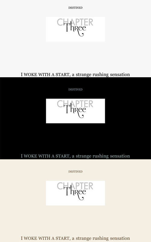
I could have set a margin-bottom value rather than insert the individual line break (<br />) tags, but I chose not to so because I use the same type of image as the heading for my other pages (Table of Contents, Research Notes, etc.) and didn’t want that much space under those. You have more freedom with images as chapter headings, but like I said before, there’s a downside. This is how that chapter looks on Kindle for iPad, in the three different screen settings (white, black and sepia)

You can see how that doesn’t look so perfect. For some reason, even on white it looks weird, because iPad’s “white” Kindle background is really light gray. And since transparent GIFs or PNGs don’t’ work in the Kindle software, you’re pretty much stuck with the white. Personally, I’m going to keep the images, because I like them better and they look find on the Kindle itself. I wish I could substitute different images for each background type, but I can’t. So that’s the trade-off, and I’m okay with it right now. It’s really only bad on the inverted white-on-black setting. The others it’s more subtle.
If you choose to go the image route, don’t make the same mistakes I did: First, I made the images too big and had to redo them all. My final size is a width of 300 pixels, which ended up pretty good. Also, I did them in GIF format first, thinking the resulting smaller file size and transparent background would help. Nope. Kindle converts everything to JPG anyway, and ignores transparency. So again, I had to do them all over again. Pain. In. The. Ass.
Okay, I seem to have taken most of my afternoon again. *sigh* I guess Table of Contents will have to wait another week. Probably for the best, as that ended up being somewhat complicated. I hope my tips are helping someone out there!


Thank you so much for this info. So, I should make the images as JPGs, not GIFs? While researching this topic, someone had said to make them GIFs, but I don't want to waste time :)
ReplyDeleteAccording to the KDP site's guidelines, covers must be JPEG or TIFF format. Images inside the book can be JPEG or GIF, and it says anything else (or anything exceeding their 127KB max size) will be "recompressed as JPEG files." So it's probably best to do everything in JPEG from the start if you can.
ReplyDeleteWhen I formatted it for ePub (Nook, iBooks, etc.), I used PNG files for the images because they tend to be smaller and sharper. So what you may want to do is when you go to save your images, save them as a few different formats at the start. That way you won't have to go back later and re-create them or convert them to another format if the one you choose first doesn't look right, or you want to switch them later or use a different format outside of Kindle.
Hope I could help some! Thanks for reading the blog. :)
Thank you, Allison, for your formatting tips. I am going through hell trying to upload illustrated Moose Joke Books -- yeah, you read that right -- onto KDP. At first, like you, I made images in the sharpest, smallest file size. But although Kindle says they "accept" internal PNGs, I found that they apparently turn them in JPGs, which distorted them greatly in color. So I went back and made everything -- I have around 100 sizeable illustrations and around 100 tiny transparent gif icons in each book -- into GIFs because in my Kindle Previewer, the GIFs looked okay. BUT DOES KINDLE ACTUALLY TURN EVERY INTERNAL IMAGE TO A JPG? If so I need to put everything into a JPG, right? A-G-
ReplyDeleteG-G-H! A giant pain. Line drawings and blocks of color aren't meant to be JPGs. And JPG file sizes are comparatively HUGE! I have found that my ePub files triple in size when I convert them to MOBI (for the Kindle): 2MB to 6 or 7 MB.
Finally, would it be acceptable to have the ePub versions of my books look like my original vision and the Kindle version have a slightly different formatting look to account for the fact I need to create JPG "spacers" and "icons" instead of transparent GIFs?
Whew! I apologize for all this verbiage. But I have gone through so much pain over these issues. Thank you so much for any suggestions.
Daniel Berenson (of Freaky Dude Books. You can find flip books there that illustrate what I'm talking about.)
Hi Daniel. Sorry to hear about your headaches with the Kindle formatting. I don't now remember where I saw that it turns every internal image into a JPEG, and it's possible it doesn't do that any longer. I know they updated the Kindle software not long after I published my book, so there's a chance that aspect of it changed. Their help guides (https://kdp.amazon.com/self-publishing/help?topicId=A2RYO17TIRUIVI) state that they can handle either JPEG or GIF, and that any other image type will be converted to JPEG, so GIFs might be safe now. I should probably add an update on this post for future readers.
DeleteSince I only used B&W images, I can't give much advice in terms of the color issues. I can say that the Kindle Previewer does not show the most accurate quality. My experience was that images in Kindle Previewer were very fuzzy, yet clear on an actual Kindle.
My advice would be to try it with the GIF images that you have and instead of using the Kindle Previewer, see if you can download a Kindle app (if you don't have a Kindle yourself to test it on) and view the file in that. It should give you a better idea of how your book will look to a reader. Since your book is so image-heavy, you probably don't have to worry as much about how it will look on an e-ink Kindle (which has no color), but rather the Fire or tablet/PC app. I'd say if the GIFs look good on those, you're good to go. And don't stress too much over there being little differences in how the ePub looks to how the Kindle edition looks. If they're both all right - just slightly different - no one is likely to notice. People will buy one version or the other, but not both.
Have you tried to find an alternate way of spacing your images without having to use image spacers? If you can do the spacing with HTML code instead, that will reduce your final file size.
Good luck with the book. I hope I was able to help a little. And happy new year! :)