Usually, I use a holiday weekend as an excuse to slack off, but this weekend I’m going to have to make myself work harder, because for the next 3 weeks, my hours at the day job are being increased to cover for a manager who is going on vacation. I’m happy to do it: he covers for me when I take vacations, so it’s only fair. But part of me is crying inside at the loss of at-home writing/editing time. Though who knows, I may end up bringing my writing work with me to help fill time, so it might work out all right. Shhh, don’t tell my boss. ;)
Anyway, I’m nearly done with my last (I swear!) edit, so I should finally have my Kindle ebook fully-formatted. At that point, I need to decide if I want to keep on the ebook route and work on the ePub version next, or take an ebreak and start formatting the print version (going back to ePub later). I’m still undecided, though if I’m going to be stuck at work more for a while, maybe the print version is best: I can work on InDesign there.
Before I get back to that editing, I figured it was time to get another blog post up. I meant to blog more often than this, but haven’t had much to say recently. Hopefully that will change soon! For this post, I thought I’d do a run-down of some of the better tips I’ve found/discovered as I’ve slogged through the process of formatting an ebook for Kindle.
Some handy CSS codes
You don’t want to go too crazy with the styling here, because one of the wonderful things about the Kindle is the flexibility it offers readers in terms of fonts. It lets you set your own font size as well as the font itself, if, for example, you prefer to read in sans serif. Still, there are a few things that you’ll want to do to enhance your book’s look.
Paragraphs
Initially, I wasn’t styling my basic paragraph (<p>) tag. The Kindle automatically adds an indent on each paragraph, so it didn’t seem necessary to do anything. But then I put my book on my iPad so I could read it on the Kindle software there and get an idea what it will look like on another device. For some reason, Kindle for iPad doesn’t use the same paragraph rules, and there the indents were almost nonexistent. One or two spaces at most. It looked bad and made for difficult reading. So, after asking around and getting some helpful advice on the Absolute Write boards, I decided to add this line of code to my CSS (the section of the document within the <head> tags, before the <body> tag):
p { text-indent:1em; }
By doing so, it doesn’t seem to have affected the way the book looks on the Kindle itself, but now when viewed on the iPad (and, according to what I’ve rad online, Kindle for PC/Mac and mobile phones) each paragraph has a nice indent. I initially tried it with a 2em indent, but that was too big. Kindle doesn’t do fractional ems, so I had to drop down to 1em. (1.5em would have been rounded up to 2em.)
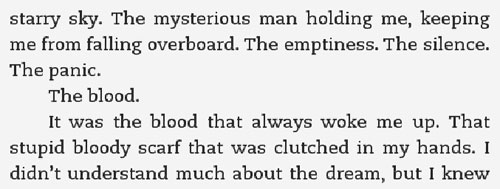
Here is how the basic paragraphs look on Kindle (as seen on Amazon’s Kindle Previewer, which is very handy if you just need to take a quick look at something without the hassle of uploading to your kindle or other device, or if you don’t have a Kindle):

This next bit is handy to have for those times you want to override the Kindle’s auto-indenting (or, if you used the above code, your own). I use it mainly for the first paragraph of every chapter and for section breaks—those breaks between scenes that are important enough to separate, but not drastic enough to warrant a new chapter. Everyone styles these breaks differently. Some put images between to make them stand out more, from simple lines or dashes to more elaborate flourishes. Others (I fall into this group) merely add a blank line and remove the paragraph indent. I also, like many others, chose to use all caps for the first 4 words of the first sentence (I’ll cover the styling for that shortly). After some trial and error, I’ve found the following CSS looks the best. I created a paragraph class called "nodindent," gave it an indent value of zero and a top margin of 50. This keeps it from indenting and adds that blank line above to keep it separated from the previous paragraph.
p.noindent { text-indent:0; margin-top:50;}
The corresponding code to use within the text of your book:
<p class=”noindent”>Text here</p>
Now, as mentioned above, you might also want to make that new section (or new chapter) stand out even more by capitalizing the first few words of your non-indented paragraph. I chose to do it with the first four words, but some use 3 and others go so far as to use all caps for the entire first sentence. It’s up to you. To do this, I didn’t need to set up any special CSS classes, I just needed to use the following code within the text itself:
For the start of a chapter: <p class=”noindent”>F<small>IRST PARAGRAPH OF THE</small> new chapter. Blah blah.</p>
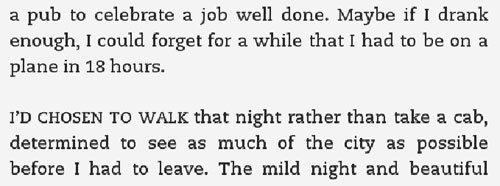
<p class=”noindent”><small>FIRST PARAGRAPH OF THE</small> new section. Blah blah.</p> What I did there was use the <small> tag to type in small caps, but didn’t start it until the second letter of the first word, thus giving a subtle up cap to the start of the chapter. (Kindle can’t do drop caps as far as I know. Not easily, at least. You might be able to do it with images and text wrap, but I haven’t tried it.) There are other ways to make that first letter bigger (the <big> tag, for one), but I prefer the less in-your-face version here. For the new section, I started the <small> tag right away, making all the letters in those first four words small caps. The exception in these would be if you had a proper name within those all-caps words. You would want to end the <small> tag before the proper name, let the first letter of the name be normal (but still capital, of course), then start the <small> again. Like such:
<p class=”noindent”><small>NEW SECTION WITH</small> P<small>ROPER</small> name. Blah blah.</p>
Example of new chapter:

And example of a new section:

I’ve also used the noindent class in some of the front and back matter of my book. It can be very handy to have available.
Another handy CSS code is align left. Kindle’s default formatting is to justify paragraphs (as seen above: words are spaced so that both right and left margins are even), but there may be time where you’d rather keep the left margin ragged and the word spacing normal. To do so, create a paragraph class called, naturally, left:
p.left { text-align:left; }
The corresponding coding in the text itself:
<p class=”left”>Text here</p>
I don't use this in my own book, so I don't have an example to show, but this can also be done to right justify and center (just switch "left" for "right" or "center").
One last paragraph style, which I used specifically for my copyright page, but could be used for anything you wished. This style has no indenting, space above (though not as much as the section break) and smaller text.
p.copy { text-indent:0; margin-top:30; font-size: smaller;}
I found that with the normal text size, my copyright page didn’t look as nice, so I created one with smaller text. Basically, if you know a little CSS, there are a lot of things you can do to make your book look nice without going overboard or interfering with the reader’s ability to customize for their own preferences and comfort.
Other handy CSS codes to know
Quotation marks. The curly quotes used in Word and other programs don’t translate to HTML. If you leave them in, the Kindle will show it as a bunch of symbols, and that doesn’t look good. So, in order to fix this, before you start doing the HTML, you have to do a find-and-replace (on PCs, it’s ctrl-H in most programs). First find all the left quotes and replace them, then do the right quotes. Then, you might also want to do all your apostrophes, because curly apostrophes have the same problem. You can replace them with a straight apostrophe, but I found it doesn’t look as nice. Here are the codes for all three:
Left quote: “
Right quote: ”
Apostrophe: ’
Other handy codes:
Em dash (—):— Copyright symbol (©):
© Ellipses ( . . . ): .
. . There are many more here, including all the various foreign characters you may run into: Special Characters in HTML.
This is getting pretty long, so I think I’ll wait until another day to cover tips on covers, chapter headings, images, table of contents, etc. It seems every time I sit down to do one of these blog posts, it takes most of my afternoon. I need to go edit!
Note: One of the sites I used most when I was starting out on this Kindle formatting journey was Natasha Fondren's Kindle Formatting Guide. Having done web design for a while, and being familiar with HTML and CSS, I already had knowledge of the codes themselves, but as the Kindle only accepts minimal coding, she was endlessly helpful in learning what would and wouldn’t work. And she just recently published a post on cover design that would have saved me a TON of time a month ago when I was designing my cover! Hopefully she can help others, because the information she gives in one post took me weeks to find all over the Internet. You wouldn’t believe how many hours I spent Googling to find information as simple as the standard cover dimensions for the Kindle screen! (600x800, if you were curious)


*tells your boss*
ReplyDelete