
 The proof of my print edition arrived today! It's all shiny and pretty and I'm in love with it. I haven't had a chance to really go through it to look for errors, but the quick scan I did looks good, so I'm hopeful.
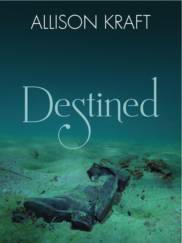
I'd prefer not to have to resubmit and buy another proof, but if I do find something inside that needs fixing, I may also tweak the cover a little. For one thing, it printed a tad bit darker than I intended. I find that problem crops up a lot with printing—something will look perfect on a monitor, but will print dark. Still, it's only a slight bit darker, and I doubt anyone but me would even notice. I also may change the description on the back. I used the one from my website, but have since edited it a little (nothing drastic, just a few words here and there), and now that I'm looking at the book, I'm wondering if it isn't too wordy. The font size is a little small due to the length, and a bit light as well (it's white on black). I could cut down the amount of text and therefore make the font bigger and/or bolder, without taking up more space. And if I'm going to be doing that, I really should get an author photo taken to add to the back cover. I don't have one right now, and I don't think it's too big a deal for it to not be there, but if I'm going to be resubmitting, might as well add it, right?
I have to say, I'm really impressed with the quality of the book. Coming from a POD, I was worried it was going to look "homemade," but it really doesn't. If I didn't know any better, I wouldn't be able to tell the difference between it and a traditionally-published trade paperback! The one thing that glares at me right now is the lack of publisher name/logo on the spine. Every book has that, and since I chose not to start my own company right now, I don't have a publisher name to use there. Hm. Maybe I should come up with a logo for myself and put it there instead?
For those of you who are considering self-publishing and are wondering which POD to use, I highly recommend CreateSpace. Great quality product, quick and easy process, no complaints at all so far. And by buying the $39 pro plan, I'm able to keep the selling price under $10 and still make a small profit on each book I sell through Amazon.com. (I'd have to go up to $11 or more to profit on the extended distribution channels, but I have no plans to use those now, so it's not a concern to me.)


I just got my Createspace proof on Wednesday! I found that after looking at it online so many times, it seemed odd in person. It's a closeup of a face, and IMHO, it looks great as a thumbnail on Amazon, but in person it's a bit "hello! I am a face! Look at my eyeball!"
ReplyDeleteAnyways, just wanted to say your cover looks nice. :-) Best of luck in your epub endeavours! I just started too.
Yay! That looks really cool. And you're right, only you would notice it was a tad darker. Nerd. :) But it looks fine to me. This is really exciting!
ReplyDelete@anann73 I'm sure it's just me being picky, and the more I look at it, the less it bothers me. But I will have to make changes inside, so I might lighten it a little anyway. :) Thanks!
ReplyDelete@dalyamoon.com It seemed a little strange to me, too, to see it on paper like that. So far all the formatting is good, but I'm finding tiny mistakes that I missed all the times I edited it on the computer. There's something about reading on actual paper that makes it easier to spot things, I think. So it looks like I'll be doing a second proof.
ReplyDeleteThanks for the compliment on the cover! I'm really pleased with how it turned out. :) Good luck on your book as well!